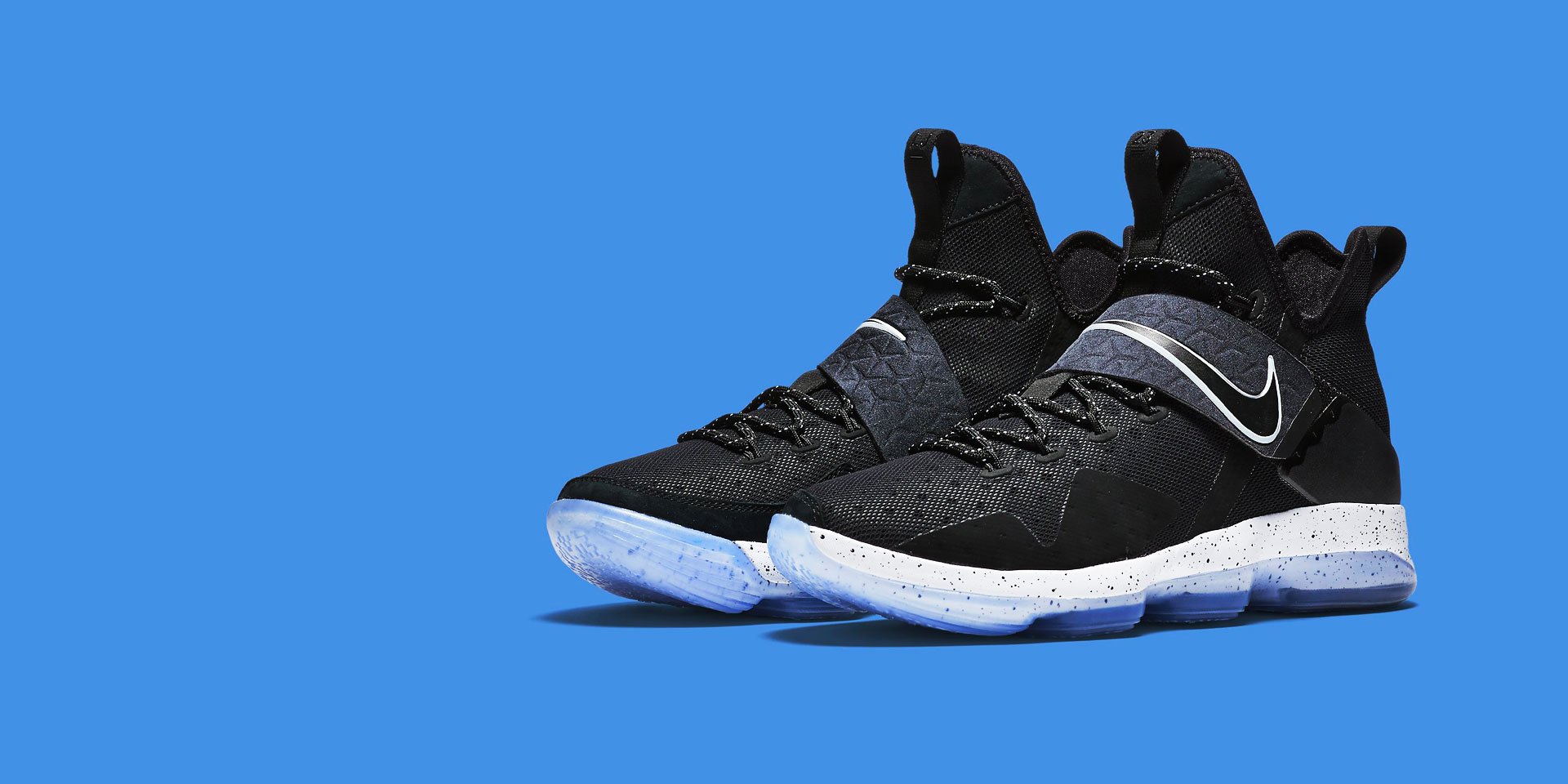
Create beautiful, responsive and professional marker with highly customisable styles.
Our Leadership
Discover a seasoned team of BPO experts who come from every corner of industry. Financial gurus. Business leaders.
Corporate Responsibility
We believe in adopting responsible business practices that create positive change in society.
Mission & Values
Our mission is to help our clients make distinctive, lasting, and substantial improvements in their performance.
Awards & Accolades
The industry has recognized us for our consistent endeavors to provide end-to-end customized solutions.
Business Partnerships
Business Partnerships Group focuses on building an ecosystem of partners across industry domains and technologies
Content Fields
Marker Item Settings, learn more about the marker item settings. Here is a short overview.
| Setting | Description |
|---|---|
| Left | Enter the horizontal position of the marker in percent |
| Top | Enter the vertical position of the marker in percent. |
| Title | Enter marker item title |
| Meta | Enter marker item meta |
| Content | Enter marker item content |
| Image | Select the image for marker item |
| Image ALT | Enter the image's alt attribute. |
| Button Text | Enter the text for button link. |
| Button Style | Select the style for button link. |
| Button Size | Select the size for button |
| Card Style | Select the Style when hovering/clicking on marker items |
| Position | Select the Position for marker item when hovering/clicking on marker items |
Marker Settings
Marker Settings, learn more about the marker add-on settings. Here is a short overview.
| Setting | Description |
|---|---|
| Image | Select background image for marker items |
| Image Alt | Enter the image's alt attribute (SEO Purpose) |
| Image Overlay Effect | Set an additional transparent overlay to soften the image, i.e: rgba(34,34,34,.8) |
| Background Overlay Color | Custom your overlay color background for image, leave default if not needed |
| Popover Mode | Display the popover on click or hover |
| Popover Width | Enter a width for the popover in pixel |
General Settings
General settings, which are the same across all add-ons, are grouped in a General section at the bottom. Here is a short overview.
| Setting | Description |
|---|---|
| Margin | Keep the existing vertical margin (e.g. from headings), force specific margin or remove all margin. Margins of an element can be removed from the top and bottom. |
| Remove top margin. | Use this option to remove the add-on's top margin |
| Remove bottom margin. | Use this option to remove the add-on's bottom margin |
| Animation | Apply the animations effect to the dropdown on hover/click |
| Duration | You can also determine the animation's duration for dropdown animation. |
| Alignment | This option specifies the alignment of an add-on according to the surrounding element |
| Text Breakpoint | Define the device width from which the alignment will apply. |
| Visibility | Define when the add-on should be hidden. |
| CSS Class | If you wish to style a particular content element differently, then use this field to add a class name and also refer to it in your css file. |