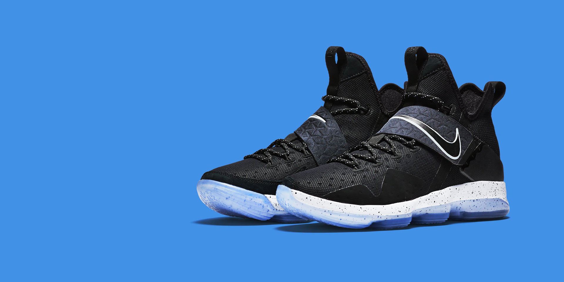
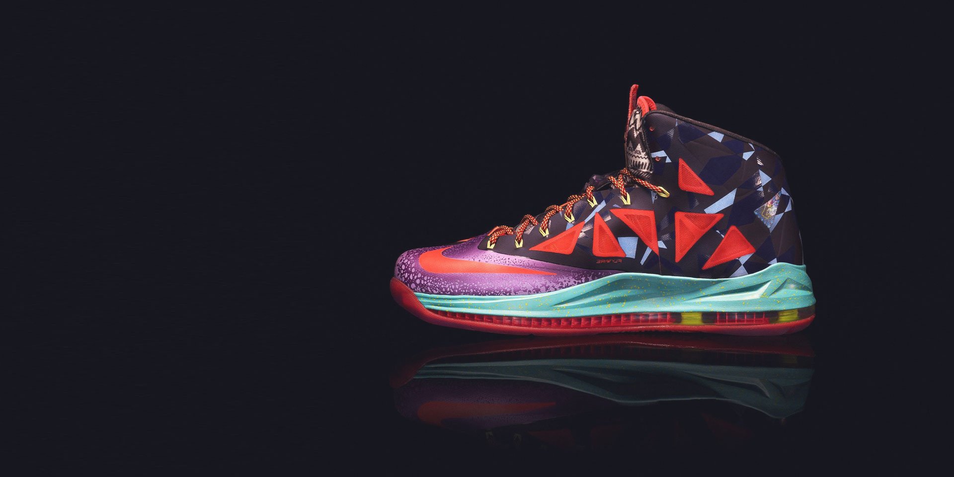
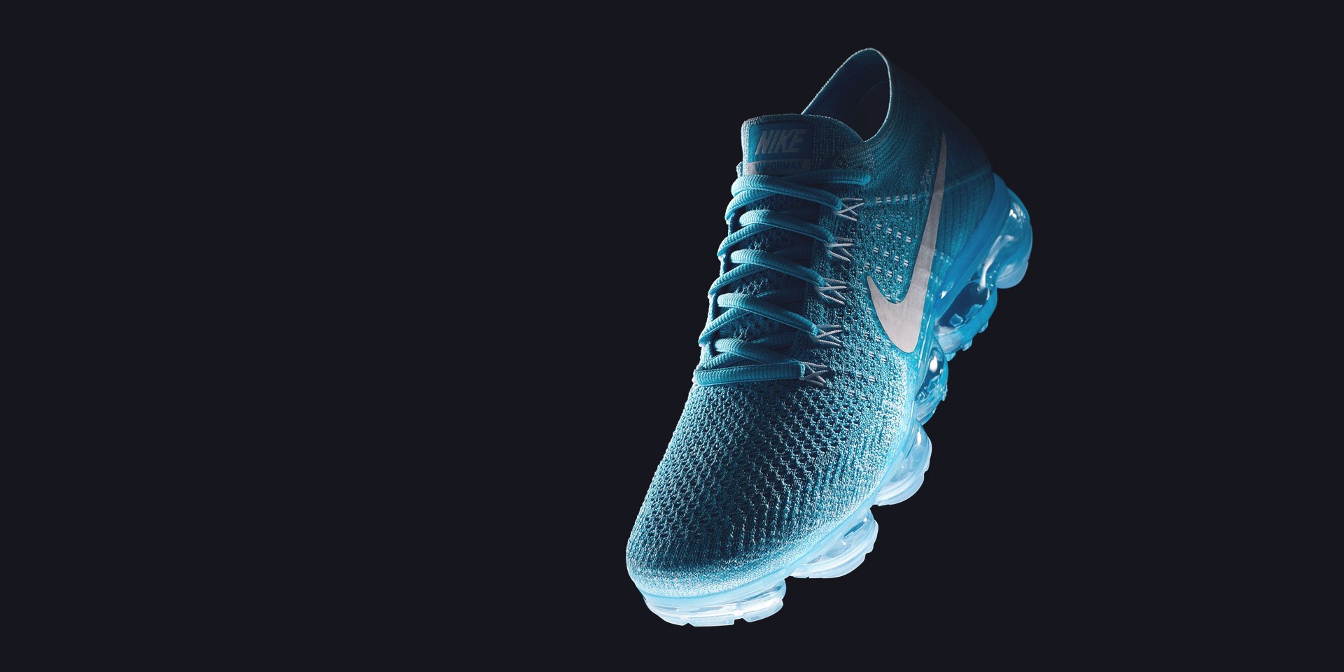
The Slideshow component is fully responsive and supports touch and swipe navigation as well as mouse drag for desktops. When swiping between slides, the animation literally sticks at your fingertips or mouse cursor. It even accelerates to keep up with your pace when you click through previous and next navigation. All animations are hardware accelerated for a smoother performance.
Content Fields
Here is a list of common content fields for Slideshow add-on.
| Setting | Description |
|---|---|
| Image | An image field with an image picker. |
| Image ALT | Insert Alt text, which is an important for SEO purposes and part of making a site accessible. |
| Title | A text field used for Title of the slideshow item |
| HTML Element | Choose on of the elements to fit your semantic structure. |
| Style | Heading styles differ in font-size but may also come with a predefined color, size and font |
| Meta | A text field used for meta text like the author or publication date. |
| Content | A text field for the main text blocks. |
| Use Custom Link | A checkbox field used for adding Button of the slideshow item |
| Text Color | Set light or dark color mode for text, butons and controls |
| Navigation Thumbnail | An image field with an image picker. This image is only used if the Thumbnav navigation style is set. |
| Alt Thumbnail | Insert Alt text, which is an important for SEO purposes and part of making a site accessible. |
Slideshow Settings
Learn more about animation settings and how to use the settings.
| Setting | Description |
|---|---|
| Height | The slideshow always takes up fullwidth, and the height will adapt automatically based on the defined ratio. Alternatively, the height can adapt to the height of the viewport. Note: Make sure, no height is set in the section settings when using one of the viewport options. |
| Ratio | Set a ratio. It's recommended to use the same ratio of the background image. Just use its width and height, like 16:9 |
| Min Height | Set the minimum height. This is useful if the content is too large on small devices |
| Max Height | Set the maximum height |
| Box Shadow | Select the slideshow's box shadow size. |
| Add extra bottom shadow | Add Add extra bottom shadow below slideshow |
Animation Settings
Learn more about animation settings and how to use the settings.
| Setting | Description |
|---|---|
| Transition | Select the transition between two slides (Support 05 style animation: Slide, Pull, Push, Fade, Scale) |
| Autoplay | To activate Slideslide autoplays to the attribute. |
| Ken Burns Effect | Select the transformation origin for the Ken Burns animation |
Navigation Settings
Learn more about navigation settings and how to use the settings.
| Setting | Description |
|---|---|
| Navigation Display | Select the navigation type, show or hide navigation control. |
| Show navigation below slideshow | Use this option to show the navigation below the slideshow images, you can choose the position/margin or color mode of the navigation too. |
| Vertical navigation | Set Vertical navigation style mode. |
| Position | Select the position of the navigation. |
| Margin | Set the vertical margin. |
| Breakpoint | Display the navigation only on this device width and larger. |
Slidenav Settings
Learn more about slidenav settings and how to use the settings.
| Setting | Description |
|---|---|
| Position | Select the position of the slidenav. |
| Show on hover only | Display Slidenav on hover only |
| Margin | Apply a margin between the slidnav and the slideshow container. |
| Breakpoint | Display the slidenav on this device width and larger. |
Overlay Settings
Create an image overlay, which comes in different styles.
| Setting | Description |
|---|---|
| Margin | Apply a margin between the overlay and the image container. |
| Overlay Positions | A collection of utility classes to position content (support 13 positions) |
| Overlay Style | Select a style for the overlay (06 styles support). |
| Width | Set a fixed width for overlay content. |
| Overlay Parallax Animation | Choose between a parallax depending on the scroll position, which is applied once the slide is active. |
| Overlay Transition Animation | Choose between an animation depending on the scroll position, which is applied once the slide is active (15 styles support) |
| Title Transition Animation | Select a transition effect for the Title. |
| Meta Transition Animation | Select a transition effect for the meta text. |
| Content Transition Animation | Select a transition effect for the content. |
| Button Transition Animation | Select a transition effect for the button. |
General Settings
General settings, which are the same across all add-ons, are grouped in a General section at the bottom. Here is a short overview.
| Setting | Description |
|---|---|
| Margin | Keep the existing vertical margin (e.g. from headings), force specific margin or remove all margin. Margins of an element can be removed from the top and bottom. |
| Remove top margin. | Use this option to remove the add-on's top margin |
| Remove bottom margin. | Use this option to remove the add-on's bottom margin |
| Animation | Overwrite the animation settings from the section. This won't have any effect unless animations are enabled for the add-on. |
| Alignment | This option specifies the alignment of an add-on according to the surrounding element |
| Text Breakpoint | Define the device width from which the alignment will apply. |
| Visibility | Define when the add-on should be hidden. |
| CSS Class | If you wish to style a particular content element differently, then use this field to add a class name and also refer to it in your css file. |


